I’ve been learning about georeferencing (what is georeferencing) maps for an upcoming project at work to display a print map (24 x 36 inch) where the library provided services circa 1912.
My secondary goal for georefencing these maps is to provide a web map layer for users to browse historic Cleveland at a high resolution detail (i.e. at zoom level 19-20).
Before I started this, my knowledge on georeferencing wasn’t much and I didn’t know what I’d use as the base map for my project - one that would provide viewers a sense of streets, intersections, and lack of sprawl in 1912…
Here’s what I learned and what I’m still trying to figure out:
The sources of paper maps:
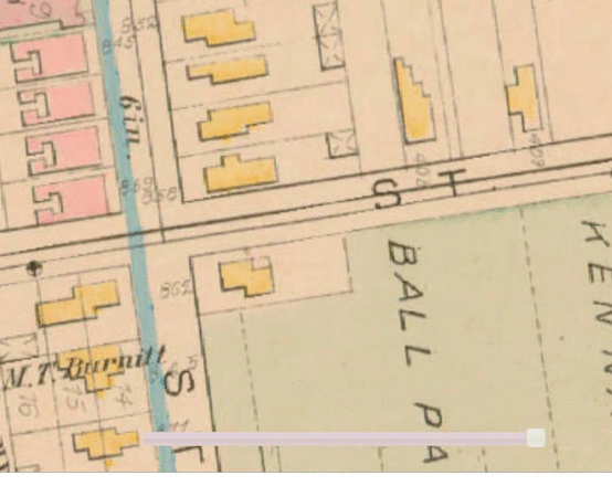
CPL has Sanborn maps. Produced every few years in the early 20th century, Sanborns richly detail addresses, landuse, streets, rivers, buildings, and often times, property owners, of the entire city. Sometimes the buildings usage was also noted. In addition to their utility, they are relatively asthetically pleasing. They’re also available at an extremely fine scale, a scale of 200 feet per inch.
These maps were published as a bounded book of ‘plats’/’plates’ - pages - each roughly 15 by 10 inches of an arbitrary geographic area.
CPL also have “Hopkins Maps”, made by a different company, but same physical layout and map design.
Fortunately, CPL has unbounded a few editions, digital scanned them, and uploaded them into in our digital map collection
For the city of Cleveland’s 1881 Hopkins maps, there are 40 pages; each image with borders containing extraneous information (page number, map key) and on several pages, contained areas that are also displayed on another plat.
Although the LOC will eventually be uploading historic Sanborn maps of the entire country, they have barely started the state of Ohio save for good ole’ (Monroeville).

As shown in the above image, there’s extraneous information (the map scale, the north arrow, the plate number) on each page that would need to be removed or clipped out if I wanted to present them as one congruious map…
If I wanted to create a contigous map, I had a fair amount of work ahead of me:
and I didn’t even know what order I should do these steps?!
So, how do I do this?!
I had multiple questions when I first started:
Do I stitch the plat(e)s together first and then georeference them? Or do I georeference first?
What tools do I use stitch them together? (stitch - creating them as if they appeared as one contiguous image)
How much accuracy should I get from them? Is 5 meter accuracy (from a reference layer) realistic? What if the original map had distortions in it in the first place?*
Would I be able to get results as accurate as than this GIF below? (Prospect Ave didn’t exist there at the old time, this is to primarily illustrate Carnegie Ave)
(after all, I wanted to create a nice digital map layer)
(In Cleveland, OSM is pretty well aligned (usually within 5 meters) with State of Ohio aerial imagery licensed in the public domain and that is pretty darn accurate [http://ogrip.oit.ohio.gov/ProjectsInitiatives/StatewideImagery.aspx]) So, I has a good reference layer.
I spent an hour or so exploring our scanned maps to determine if there were any that, together would provide enough coverage of the city of Cleveland. Some of their metadata and descriptions our digital collections were misleading; this item has the title of Plat Book of Cuyahoga County, Ohio Complete in One Volume (Hopkins, 1914) but if you carefully read the title page of this book and view a couple adjacent pages of it, you learn that it’s just 1 of 4 volumes that are needed to have complete coverage of Cuyahoga County. Unfortunately, we didn’t even have all 4 volumes of the 1914 Hopkins available; so I couldn’t use that as a resource.
I finally found a map collection that had coverage of the entire city of Cleveland: a Hopkins book of Cleveland from 1881.
So, I started out using the public mapwarper which is really neat.
I experimented by:
Uploading each image page to mapwarper.net (for now, just manually)
Applying the “mask” that would remove the extraneous areas I didn’t need to reference
georeferencing (rectifying) them
I learned that it doesn’t matter whether you georeference or apply the mask first to a map on mapwarper;
This recommendation maybe different if you’re attempting to use the mosaic feature on there.
Lou Klepner reported that Plate Spline is most effective rectifying method on mapwarper; I haven’t noticed definitively one better than the other. For the resampling method, I used cubic spline and didn’t find any noticeable speed delay compared to the nearest neighbor.
I then downloaded the geotiffs from mapwarper - now georeferenced that have the geographic projection stored within them - so they can be displayed over other modern maps.
Now I can open the geotiffs in QGIS as raster layers. They matched up pretty well although not perfect (ADD screenshot) and I printed a portion out in QGIS’ print composer. And… You couldn’t read the street names on the printed copy. I learned that these image were scanned and uploaded as 72ppi and don’t print well. Oops. Our library didn’t save the original loseless digital scans (they had since corrected this practice several years ago for other scanned maps).
So, more searching to see if we had another map set of the complete coverage of the city of Cleveland. Yes, we did! volumes one and two of the 1912 Hopkins of Cleveland.
72 PPI images are publicly available but we had 600PPI of these in private digital storage.
I asked Stephen Titchenal of railsandtrails.com - an underrated resource for rail maps of the 20th century; he’s digitized dozens of maps. He admitted he hadn’t stitched together any map as large as I was proposing but recommended photoshop and Panavue image assembler a since abandonwared windows stitcher but he hadn’t stitched together anything as large as I was proposing. Welp. Most of his maps were 300ppi and suitable.
Guides by Mauricio Giraldo Arteaga, formerly of NYPL, National Library of Scotland, and Lincoln Mullen are great introductions to the basics of georeferencing with mapwarper but they all assume that you’re only georeferencing one image at a time and not stitching them together.
So, now: My task, I ask for readers:
Given my constraints: computing power on my work and personal computers (Thinkpad T450s, HP Z240 both with ubuntu) each no more than 16gb of ram); would I be able to work on 1 giant image of all of the items stitched together? I tried gimp on ubuntu (to be fair it was a 600 PPI) and it was nearly unusable on a single image…
It wouldn’t be realistic to upload about 3gb of images to mapwarper.net…
So, readers, I’d love to hear your suggestions and thoughts.
I ask a few questions on how to proceed:
Given my two goals (a slippy web map and a print map of 24x36inch) would 300PPI be ok for both?
In which order should I complete the tasks of cropping/masking the plates, georeferencing the plates, and stitching them together to appear as one image?
After I georeference them, should CPL provide both georeferenced and non-georefenced items in our digial collection?
Tentatively, I think I’ll batch convert (with imagemagick) the images to 300PPI; then crop 1-2 plates of them in gimp (if it’s feasible from a memory standpoint), then try to georeference them in qgis.
For sharing georeferenced, I can see both sides whether to add the georeferenced ones because georeferencing is never perfect; it’s always a work in progress.
I’d appreciate your advice for my next steps and what you’ve learned if you’ve done something similar (email is skorasaurus at gmail, the left bar has my social media contacts). I’ll share what I’ve learned later.